

The increasing use of mobile devices to buy and sell products and services is driving mobile commerce (or m-commerce). Walmart reports that around 40% of visits to their shopping website in December 2012 were through mobile devices. EBay predicts that around 30% of all e-commerce sales will take place through mobile devices by 2015. So e-commerce merchants are all out to optimize their mobile presence. There are two ways to do this – via responsive web design or via a mobile website.
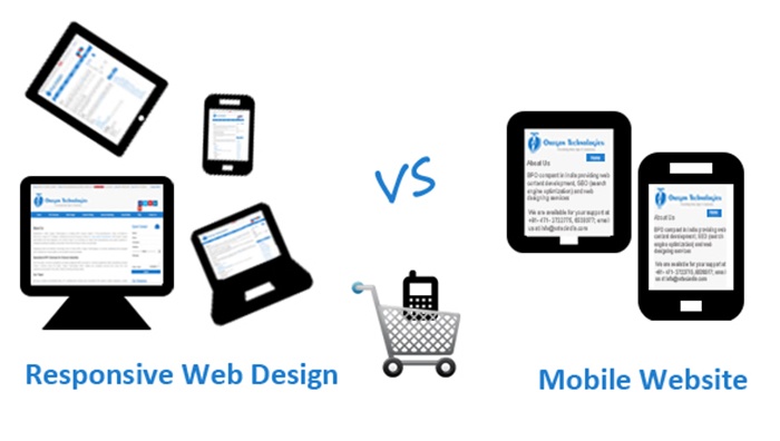
In responsive web design, website content adjusts to different types of screen sizes, such as that of a smartphone, tablet or desktop. A mobile website is one that is presents information just for mobile users. The big question is making the choice between responsive web design and mobile URLs based on which holds more value for ecommerce.
In a recently published white paper, leading mobile shopping solutions provider Shopgate maintained that m-commerce merchants would benefit more from a well-optimized mobile website than responsive website design. The view is mobile optimization can better satisfy mobile customer requirements, increase conversion rates, and improve revenue. Shopgate holds that responsive web design lacks usability as the main navigation bar could be missing, buttons and links are too minute for clicking, and images are of high resolution and do not load quickly. Responsive web design, according to Shopgate, detracts from the user experience as it does not offer a “clean interface and a fast, hassle-free shopping experience”.
With responsive design, mobile users will get the same content as on the main website and they can become impatient if they have to wade and scroll through it to find what they need. Responsive web design is best reserved for smaller sites with fewer pages.
A mobile website is a much better choice for businesses with large sites. Users can be presented with only relevant information. As you can optimize the website for mobile user requirements, load time can be reduced so that users can get faster and easier access to whatever they are looking for.
However, it is very important to optimize mobile websites for search engines. Google has made several changes in smartphone rankings to mitigate common configuration mistakes such as faulty redirects and smartphone-only errors. So, if you want to enhance your online presence via a mobile website, follow Google’s mobile SEO recommendations. Partnering with a professional web design company that offers mobile web design services and website optimization solutions is the best option to boost your ecommerce capabilities.