

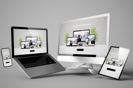
Do you want your website to look smart and function well on mobile devices including smartphones and tablets? As a reputable SEO company with more than 10 years experience in the industry, Oregon Technologies provides Responsive Web Design (RWD) solutions to help you achieve this. Responsive Design allows your website to be displayed on mobile devices with the entire range of user required features available on desktop and laptop screen, but with minimum re-sizing, panning, and scrolling. RWD is Google’s recommended configuration for building smartphone-optimized websites and the best website configuration available today.
Why You Need a Responsive Web Design
If you are about to use a separate mobile URL for your mobile website, it is time to re-think. RWD provides you with the following benefits.
Great User Experience – Since this design makes the same code work in multiple screen solutions, it provides better user-experience across many devices and screen sizes unlike a separate mobile site designed for a specific device and screen size.
Fast Loading Time – This design eliminates the need to redirect users to the device-optimized view so that your website will load faster on mobile devices.
Easy to Manage – RWD enables you to manage your website easily with one SEO campaign rather than having separate campaigns for desktop and mobile site.
Our responsive design solutions incorporate all the above capabilities and we focus on enhancing them to bring more mobile device users to your site.
What Makes a Good Responsive Design?
A fully functional RWD should have all the features mentioned below.
Fluid Grids – Instead of the typical locked grid approach based on rigid pixels or arbitrary percentage values, fluid grids are more of a layout designed in terms of relative percentage values so that all elements in the layout will resize their width in relation to another whether the layout is squeezed into a tiny screen or stretched for a large screen.
Fluid Images and Videos – This type of media does not rely on static pixels or fixed sizing, but is responsive to the width and height of a screen. They are set to their max-width of 100% so as to rest in the fluid grid and adjust according to different screen sizes.
Media Queries – Media queries can be set to detect features such as width, height, screen orientation, aspect-ratio and resolution to see whether the user is browsing from a mobile device or desktop computer/laptop and allow the web page to use different CSS style rules according to the characteristics of the device.
On the whole, the prime focus of RWD is on user needs. Our expert web designers offer responsive design solutions according to your specific requirements. Contact us at +91- 471- 2472775, 6538377 to discuss your project or send an e-mail to info@ortecindia.com.